Quick panel — 4 Samsung One UI 6 style options
Replacing two side drawers with one proper bottom sheet, Samsung-style.
You're right — two side panels is overkill and neither one is styled like a modern phone panel. The Samsung One UI 6 quick panel pulls up from the bottom as a sheet with a drag handle, big rounded tiles, a status card at the top, and a blurred edge. It's a "designed" feel — not a plain sidebar. Let me show you 4 ways we could do the same thing in Oscar.
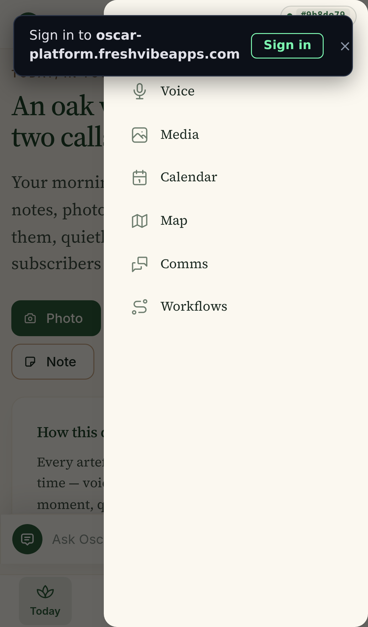
Current state Two right-side drawers
Tools (6 items: Voice, Media, Calendar, Map, Comms, Workflows) and More (7 items: Projects, Surveys, Notes, Reports, Writing, Settings, All tools). Both are 280px wide right-side drawers with a vertical list of icon + text rows. No grouping, no hero card, no Samsung-style design.
Total 13 nav items, but the user has to know to tap TWO different buttons to see all of them.
The 4 options
Samsung-style bottom sheet — hero card + tile grid
"Pull up from the bottom, see your day at a glance, then tap any tile to dive in."
Trade-off: the hero card takes vertical space (about 70px), so the grid is 3 rows × 3 cols instead of 4×3. The panel also needs to scroll on a small phone with 12 tiles.
iOS Control Center style — frosted glass, 4×3 grid, no hero
"Frosted-glass sheet from the bottom, like iOS Control Center. Just the tiles, no extra story."
This is my recommended one. 12 tiles in 4×3 fits one phone screen with no scrolling. The frosted glass background shows the page dimmed behind it. The 3 status pills at the top are like a "today's stat" without being a giant hero card. The grid is colour-coded by category so Mark can find what he needs.
Tabbed bottom sheet — Work / Capture / Me tabs
"Bottom sheet with three tabs at the top, one grid per tab. Like a folder switcher."
Trade-off: two extra taps to get to anything (tab + tile). The current "12 tiles in one view" beats this for speed.
Top drawer (Material You) — tiles fall from the top
"Tiles fall from the top, like Material You notifications. 4 columns of solid colour tiles."
Trade-off: the page below is hidden (the bottom 70% is just the page with no UI). On a 390px iPhone, only 4-5 rows of tiles fit before the user has to scroll. Worse one-handed usability than a bottom sheet.
Quick comparison
| A: Hero + grid | B: Frosted 4×3 | C: Tabbed | D: Top drawer | |
|---|---|---|---|---|
| All 12 items fit without scroll | no | yes | yes (per tab) | almost |
| One-handed reach (thumb) | yes | yes | yes | no |
| Samsung / iOS panel feel | yes | yes | medium | medium |
| Shows "today's status" at a glance | yes | small pills | no | no |
| Easy to find Capture tools | yes (sectioned) | yes (coloured) | yes (tab) | yes |
| No new mental model | yes | yes | tabs are new | yes |
| Replaces 2 drawers with 1 | yes | yes | yes | yes |
My recommendation: B (with a touch of A)
B is the closest match to the Samsung One UI 6 panel feel — frosted glass, 4×3 grid of colour tiles, drag handle, all 12 items in one view with no scrolling.
The 3 status pills at the top ("1 survey · 3 photos · 1 draft") are a small A-flavored hero without taking much space. They give Mark a quick read on his day without scrolling.
What we drop from the current app:
- The right-side "Tools" drawer (6 items) — fully merged into this panel.
- The "All tools" entry inside "More" — no longer needed.
- The "Tools" tab in the bottom dock — replaced by tapping the new panel.
Net result: bottom dock has 3 tabs (Today / Projects / More) instead of 4. The More panel is the Samsung-style sheet above.
Two other small things worth doing
1. Make the panel swipeable. Samsung's panel can be pulled down to dismiss and pulled up to expand. If we just add a drag handle and a thin "swipe down to close" hint, it'll feel right.
2. Match the design language. The Oscar brand uses cream + forest green + Source Serif. The Samsung panel above is too "stock Samsung" — the frosted glass + colour tiles is good, but the typography should be Source Serif for the title and the hero text. The body text can stay system.
Both of these are 30-min changes. The main change is replacing DrawerMenu.tsx with a new QuickPanel.tsx component that uses a Mantine Drawer with position="bottom" and size="78%", then render the panel content from the existing MORE_ITEMS + TOOLS_ITEMS arrays.
Mockup built 2026-07-16 14:53 UTC by Mavis. Real iPhone 13 viewport. Same icons as the current app. No code changes yet.