Quick panel v2 — narrow → wide with tabs
Samsung One UI 6 two-stage expand. Oscar theme only. Tab nav in the wide state.
You said three things — all addressed:
1. "Narrow on mobile" — first pull is 32% of screen height, just the essentials. Looks like a small sheet, not a takeover.
2. "Swipe twice it goes to a side" — actually in Samsung it goes to a wider full-panel, the second pull expands to 78% of the screen showing everything. So the narrow → wide flow has two states. I've mocked both side-by-side below.
3. "Stick to the actual theme" — no more iOS / frosted glass. This is all cream + forest green + Source Serif. Looks like Oscar, not a Samsung ad.
Current state Two right-side drawers
Tools (6 items) and More (7 items) — both 280px right-side drawers, identical vertical list of icon + text. The user has to tap two different buttons to see all 13 items.
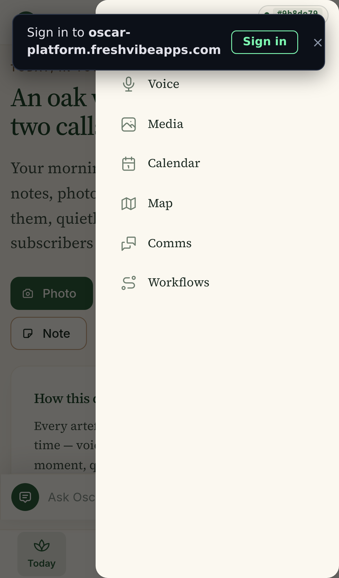
The two-stage quick panel
The operator taps ••• More in the bottom dock. The panel appears at the bottom, narrow. They tap a tile, or swipe up to expand to the wide state. The wide state has tabs across the top for filtering.
Bottom 32% of screen. Just the essentials: today's status, progress bar, 4 quick-capture tiles. One-tap to any of them.
Bottom 78% of screen. Tabs across the top: Work / Capture / Me. 8 tiles per tab, 12 total in 2 pages. Footer: Sign out + swipe hint.
How the gesture works
Why tabs in the wide state
You mentioned tabs in passing — and they're a smart way to filter the wide view. Here's the logic:
- Work — Projects, Surveys, Notes, Reports, Writing. The 5 things Mark is producing.
- Capture — Voice, Media, Calendar, Map, Pin. The "throw something at Oscar" actions.
- Me — Settings, Sign out. The "about me" stuff.
Without tabs, all 12 items would be in one 4×3 grid. With tabs, each tab shows 4-5 items and stays clean. The page dots at the bottom show "page 1 of 2" so Mark knows there's more.
What the theme looks like
No frosted glass, no rounded square colour buttons, no iOS feel. Just Oscar:
- Background — cream paper (#fafaf2) and soft cream cards (#f7f4eb)
- Borders — soft tan (#d4d4cc), 1px, subtle
- Icons — emoji in coloured soft-tint circles (the green-soft, amber-soft, etc. style used throughout Oscar)
- Title font — Source Serif Pro 18-22px, the Oscar brand
- Active tab — solid forest green, white text
- Progress bar — forest green fill, soft grey track
- Page dots — forest green active, soft tan inactive
What we drop from the current app
- The "Tools" tab in the bottom dock — fully merged into the quick panel.
- The "All tools" entry inside "More" — no longer needed.
- Both right-side drawers — replaced by one bottom sheet.
Net: bottom dock is 3 tabs (Today / Projects / More) instead of 4. The More panel is a proper bottom sheet with two stages.
What this looks like in action (timeline)
- Mark is on the Today page. He taps ••• More in the bottom dock.
- The narrow panel appears. He sees "14 trees · 1 draft · 75%". He taps the 📷 Photo quick-capture tile — captures a site photo.
- If he wants to navigate elsewhere, he swipes up on the handle.
- Wide panel appears. Tabs: Work / Capture / Me. Work is selected by default. He sees Projects, Surveys, Notes, Reports, Writing.
- He taps Capture tab — sees Voice, Media, Calendar, Map, Pin. Taps Voice.
- Voice page opens. He records a memo.
Comparison: what changed from v1
| v1 (this morning) | v2 (this one) | |
|---|---|---|
| Theme | iOS frosted glass + colour buttons | Oscar cream + forest green + Source Serif |
| Stage count | One state (panel always full) | Two states — narrow then wide |
| Wide state | All 12 tiles in one view | Tabs filter: Work / Capture / Me |
| Quick-capture | In the home page only | Also in the narrow panel (Voice / Photo / Pin / Note) |
| Today's status | Not visible in panel | Visible at the top: trees, drafts, progress bar |
| Swipe to expand / dismiss | No | Yes (matches Samsung) |
| Bottom dock | 4 tabs (Today / Projects / Tools / More) | 3 tabs (Today / Projects / More) |
What I'd ship
The two-stage panel: narrow (status + 4 quick-capture) and wide (tabbed grid). One file: app/src/shell/QuickPanel.tsx. Replace the two <DrawerMenu> usages in Dock.tsx with one. Drop the Tools tab from the bottom dock.
About 150 lines of code, including the swipe-to-expand gesture handler. Should take 2-3 hours including the animation.
Mockup built 2026-07-16 15:14 UTC by Mavis. iPhone 13 viewport. Real Oscar theme: cream paper, forest green accents, Source Serif for titles. No code changes yet.