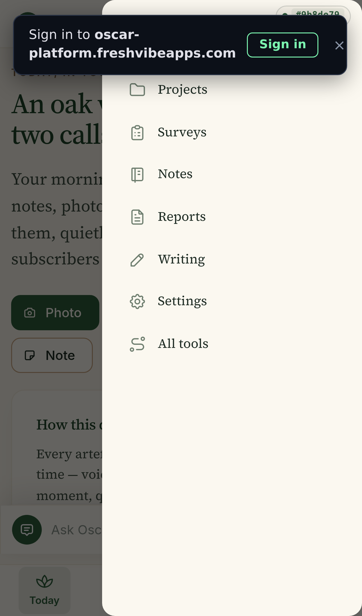
Replacing the vertical sidebar with a proper grid of icon tiles.
You're right — the current "More" is a 7-item vertical list in a 280px-wide right-side drawer. On a 390px iPhone, it takes the whole screen but only shows 4-5 items at a time, then you have to scroll. A grid of icons would show 6-8 items in one view, each tile big enough to tap, and the visual difference between icons is much faster to scan than text.
Projects / Surveys / Notes / Reports / Writing / Settings / All tools. Each item is a small icon + text on one line. 280px wide, 100% height. The other 6 capture tools (Voice / Media / Calendar / Map / Comms / Workflows) live in a SEPARATE "Tools" drawer — so the user has to know that "More" and "Tools" are two different things.
"Like the iOS share sheet. Each tile is a row with the icon on the left and the name on the right."
"Everything in one place, grouped by what kind of thing it is. One scroll, no sub-pages."
"Like the iOS home screen. Each tile is a solid colour with a white icon and a name. Eight tiles fit in the screen with no scrolling."
"The grid I showed you earlier, but with the count visible as a tiny green pill under the name. Scan by name + see at a glance which are full."
| A: 2×4 | B: 3×3 grouped | C: 4×2 solid | D: 3×3 with counts | |
|---|---|---|---|---|
| All 12 items fit in one view | no (6 fits) | yes | no (8 fits) | yes |
| No scrolling needed | no | yes | yes | almost |
| Unifies "More" + "Tools" into one page | no | yes | no | yes |
| Grouped by category | no | yes | no | no |
| Shows counts / status | yes | yes | no | yes |
| Visual polish (designed feel) | medium | medium | high | medium |
| Big enough to tap with thumb | yes | yes | just | yes |
| New user understands in 3 seconds | yes | yes | yes | yes |
It's the only option that solves the actual problem the user has — knowing where to find the right thing — by grouping tiles into 3 obvious categories:
It also unifies "More" + "Tools" into ONE page. The user doesn't have to know the difference. The bottom dock can drop the "Tools" tab entirely and the 4th slot becomes "More" (or we rebalance to Today / Projects / Capture / Me).
C is the prettiest. D shows the most info. A is the most boring. B is the most useful.
1. The drawer takes 100% of the screen height — even on a 6.5" phone the bottom 80% is empty white space after the 7 items. A bottom-sheet (slides up from the bottom, takes 60% of the screen) feels lighter and lets the user see the page behind it. But that's a separate change from the grid.
2. The "All tools" item is a meta-link to another page — it's the only item that isn't a "thing", it's a pointer to "more things". A non-technical user will tap it and be confused. With option B, this link goes away because Tools and More are unified.
Instead of one grid, you could make the bottom dock itself smarter. Right now it's 4 fixed items: Today / Projects / Tools / More. The Tools and More both feel like "everything else" to a non-technical user. What if the dock was just 3 items — Today / Capture / Me — and tapping "Capture" or "Me" opens the grid?
That's 3 dock items instead of 4, which gives each one more visual weight. And "Capture" / "Me" is a much friendlier pair of words than "Tools" / "More" — the user immediately knows what kind of thing they'll find there.
But that needs more design and is a separate change. The grid is the easy win.
Mockup built 2026-07-16 14:46 UTC by Mavis. Real iPhone 13 viewport. Same icons as the current app, just rearranged. No code changes yet — this is a design choice.