- See what's on the schedule for today
- Add a quick voice note while driving (hands-free, before he arrives)
- Check the address of the TPO
Oscar POV Audit
Looking at Oscar through the eyes of a working arborist, not a developer.
Imagine: Mark Chester, working arborist, drives to a site, parks the van, opens Oscar on his phone with one hand. The other hand has a clipboard. He has 11 minutes before the client arrives. What does Oscar do for him in those 11 minutes?
Who I'm thinking of
Mark Chester, working arborist at Tree Consultants
- 45, has been doing tree surveys for 20 years
- Doesn't really love computers. The iPhone is the most "tech" he gets in a day
- Owns one project at a time, sometimes two, sometimes three — but never more
- His clients are planning consultants and homeowners, not other arborists
- He doesn't know what an "API" is, doesn't want to know
- He will not read docs. He will not watch a video. He will try the app for 3 minutes and decide
He is not the operator (the operator, G, built this app for him). The operator is the technician. Mark is the user.
Every finding below is: "If Mark opens this, does he get it in 5 seconds?"
3 days in Mark's life
I picked three different days, because Mark doesn't always do the same thing:
📅 Day 1 — It's 7:45am, Mark opens Oscar on the way to a site
Mark is in the van. He has 15 minutes. He's going to do a TPO oak survey today. He wants to:
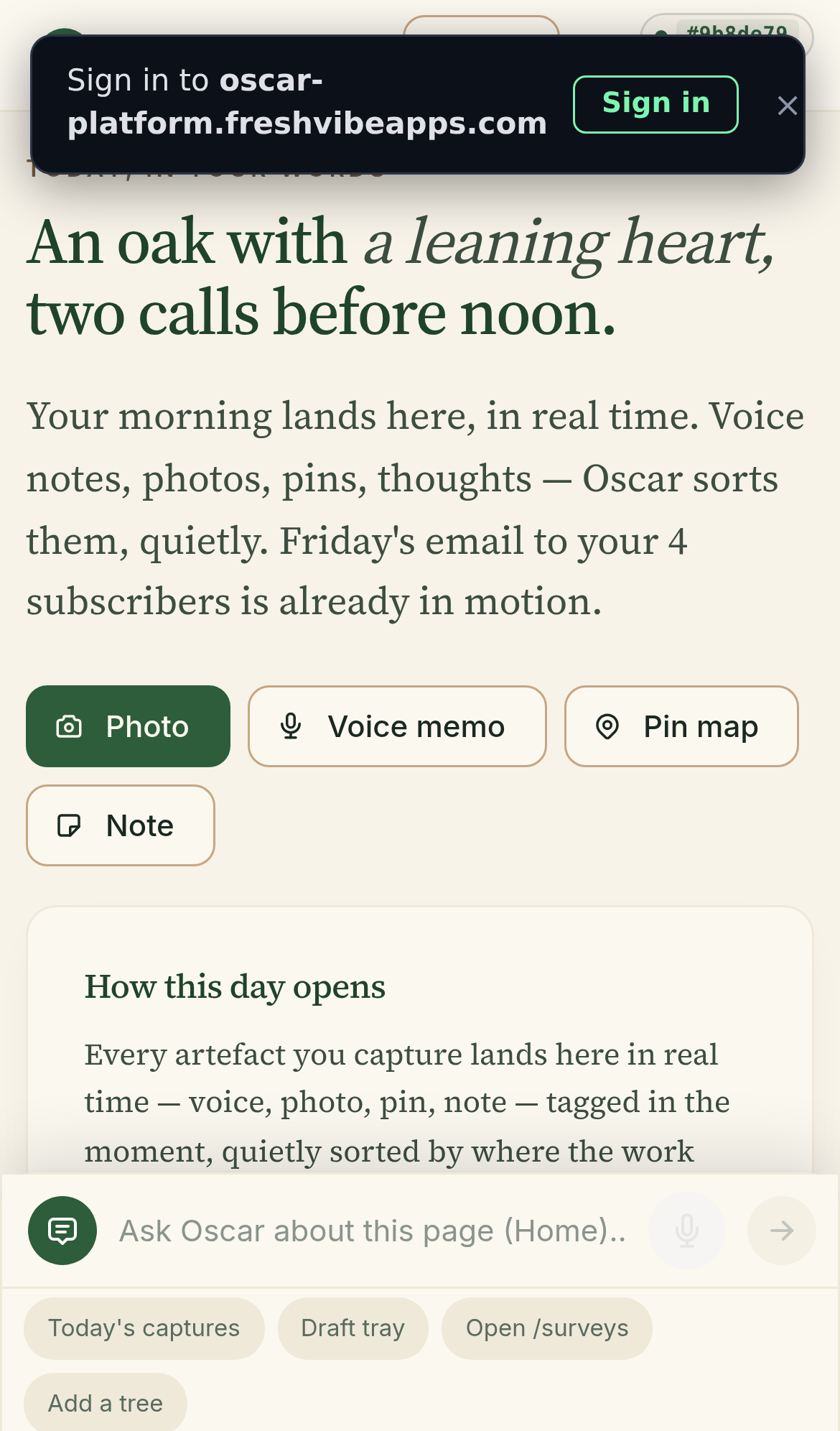
This is what Mark sees when he opens Oscar. Build #9b8de79.
Confusing
What does the home page actually want me to do?
The big quote-style text says "An oak with a leaning heart, two calls before noon." It's beautiful. But Mark doesn't need a poem. He needs to know: what's on today, where is it, and how do I capture something?
The action chips (Photo / Voice memo / Pin map / Note) are great — they're the right answer to "how do I capture?". But they're below the poem. The poem is the first thing you see. The action is the third thing.
Question
"Today's captures" widget — what is it?
There's a card titled "Today's captures" with a description. But the description is atmospheric: "Every artefact you capture lands here in real time — voice, photo, pin, note — tagged in the moment, quietly sorted by where the work actually is."
Mark reads that and thinks: "What is an artefact?" He doesn't know that word. He's a working arborist, not a museum curator. He'll know what "captures" means once he sees it working, but "artefact" is the only technical word on the page.
Good
The chips at the bottom: Today's captures / Draft tray / Open /surveys / Add a tree
These are great. They let Mark jump to what he actually needs without having to navigate through a sidebar. They feel like a quick-launcher for his work.
But the labels are technical in places. "Draft tray" — what's a tray? "Open /surveys" — the URL is showing through. Mark doesn't know what /surveys is. The chip should say "My surveys" or just "Surveys".
Bug
The build hash in the top right
Mark sees "#9b8de79" in the top-right corner. He doesn't know what that is. The green dot next to it is good (signals "all good") but the number is dev speak.
And the label "Sign in to oscar-platform.freshvibeapps.com" in the top-left is a system-level browser thing that shouldn't be in the actual app view. Mark sees it overlaying the app.
📅 Day 2 — Mark is finishing a project, wants to start a new one
Mark has just finished a survey at "Sample site — Oakwood Park" (the only project in his account right now). He wants to:
- Mark the current project as "done"
- Start a new project for next week
- See what photos / notes / data he has so far
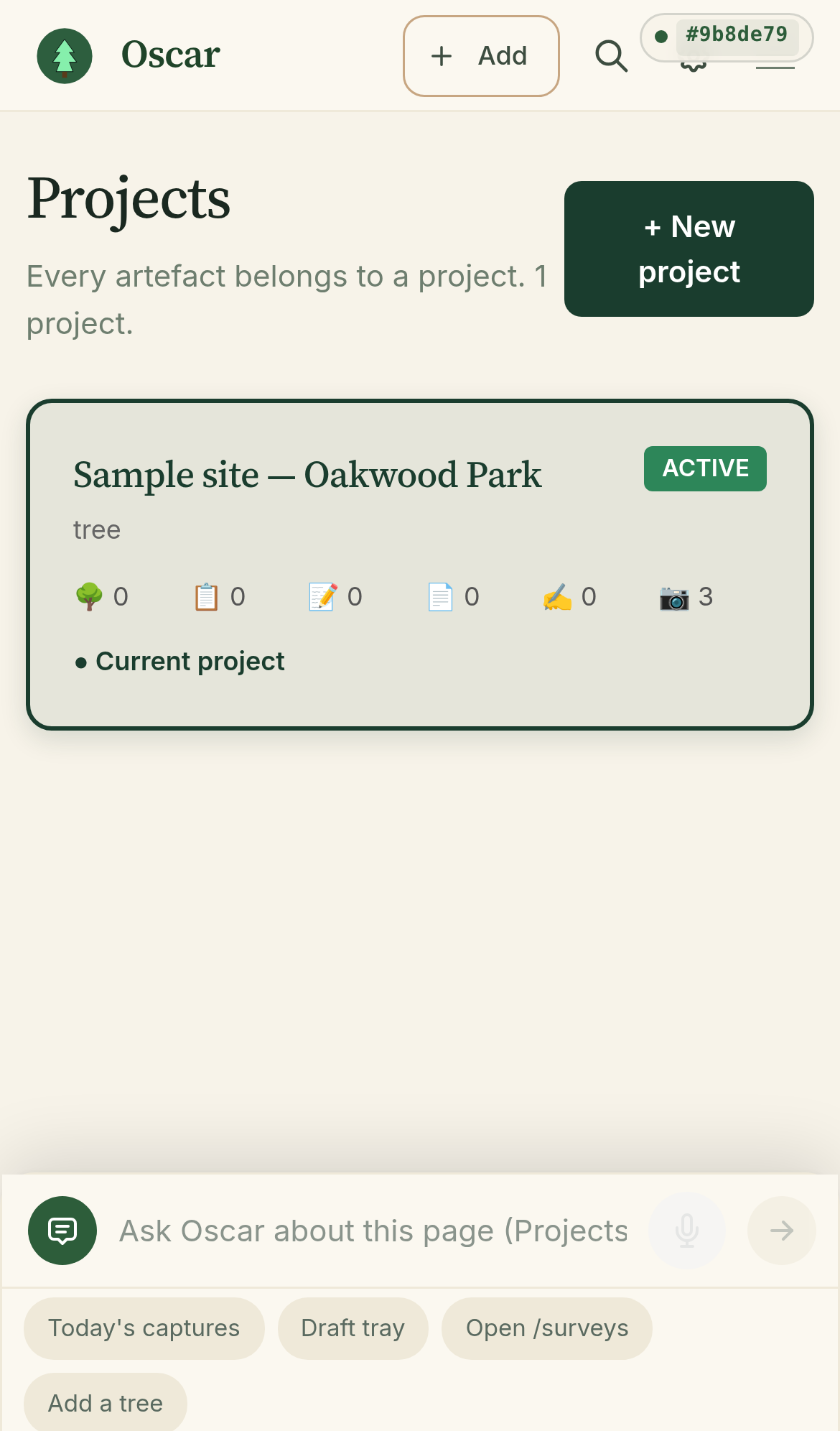
Projects page. Just one project, "Sample site — Oakwood Park".
Data leak
"Sample site — Oakwood Park" with "Sample data." is leaking
This is the operator's demo data. It's in Mark's account because the operator was testing the app. The label literally says "Sample data." at the end.
Mark opens this and his first thought is: "Is this real? Did the operator forget to delete it? Should I delete it?" He doesn't know what to do with sample data.
Inconsistent
"Current project" / "Active" — the same thing, two different words
The project card shows a green "ACTIVE" badge in the top right. Below the icons there's a "● Current project" line. Both refer to the same thing. Mark will be confused: is the ACTIVE the same as Current? Or is "active" a status and "current" a different one?
Confusing
The icon row: 🌳0 📋0 📝0 📄0 ✏️0 📷3
Six icons, six counters, no labels. Mark has to guess what each one means. He can probably figure out the tree (🌳) and the camera (📷), but the rest? Is 📋 notes, surveys, or both? Is 📄 a report, a file, a page? Is ✏️ drawings or edits?
The 📷3 means "3 photos". But Mark captured photos in the demo — those are sample data. So Mark sees "3 photos" and goes "where are they?" The card doesn't show the photos, the survey, the notes. He has to tap the project to see them.
Good
The "+ New project" button
It's big, green, top-right. Mark sees it immediately. He knows what it does. ✅
Question
"Every artefact belongs to a project"
That sub-headline uses "artefact" again. Mark might wonder: "What is an artefact? Is it the same as a project?"
📅 Day 3 — Mark is writing the report. Friday 4pm, client wants it Monday.
Mark is in his office. He has a survey on file (the "Sample site — Oakwood Park" with 14 trees, ground-truthed). He needs to:
- Find the survey
- Convert it to a report (AIA or ARB)
- Send to the client
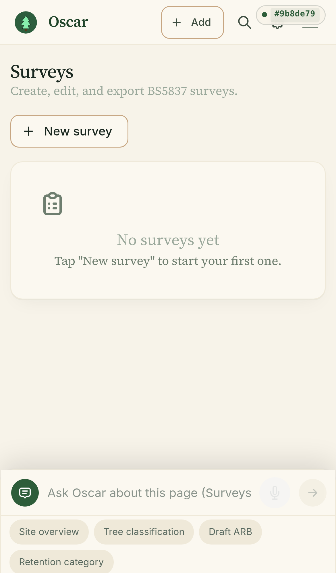
Surveys page. "No surveys yet". Mark has a survey — but he doesn't see it here.
Broken
Mark has 1 survey, the page says "No surveys yet"
The home page shows "Today's survey — BS5837 · 14 trees · ground-truthed · draft". The Surveys page shows "No surveys yet · Tap New survey to start your first one."
These two pages disagree. The survey IS in the data, the home page sees it, but the Surveys page doesn't. Mark will think "is this broken? Should I tap New survey and start over? Will I lose my existing one?"
This is a data-loading bug. Same data, two pages, two answers.
Confusing
The chip row at the bottom: "Site overview / Tree classification / Draft ARB / Retention category"
These are supposed to be AI prompt suggestions. Mark looks at them and thinks: "What are these? Are these actions? Pages? Filters?" They appear in a row that LOOKS like a button row but the buttons are actually text fields where the AI will help if Mark taps one and starts a question.
But they look like "Today's captures" style — quick action chips. Mark will probably tap "Draft ARB" thinking it'll open a draft report form. Instead, it'll fire off an AI conversation about how to draft an ARB. That's not what he expected.
📅 Day 4 — Mark opens Settings to see what account he's on
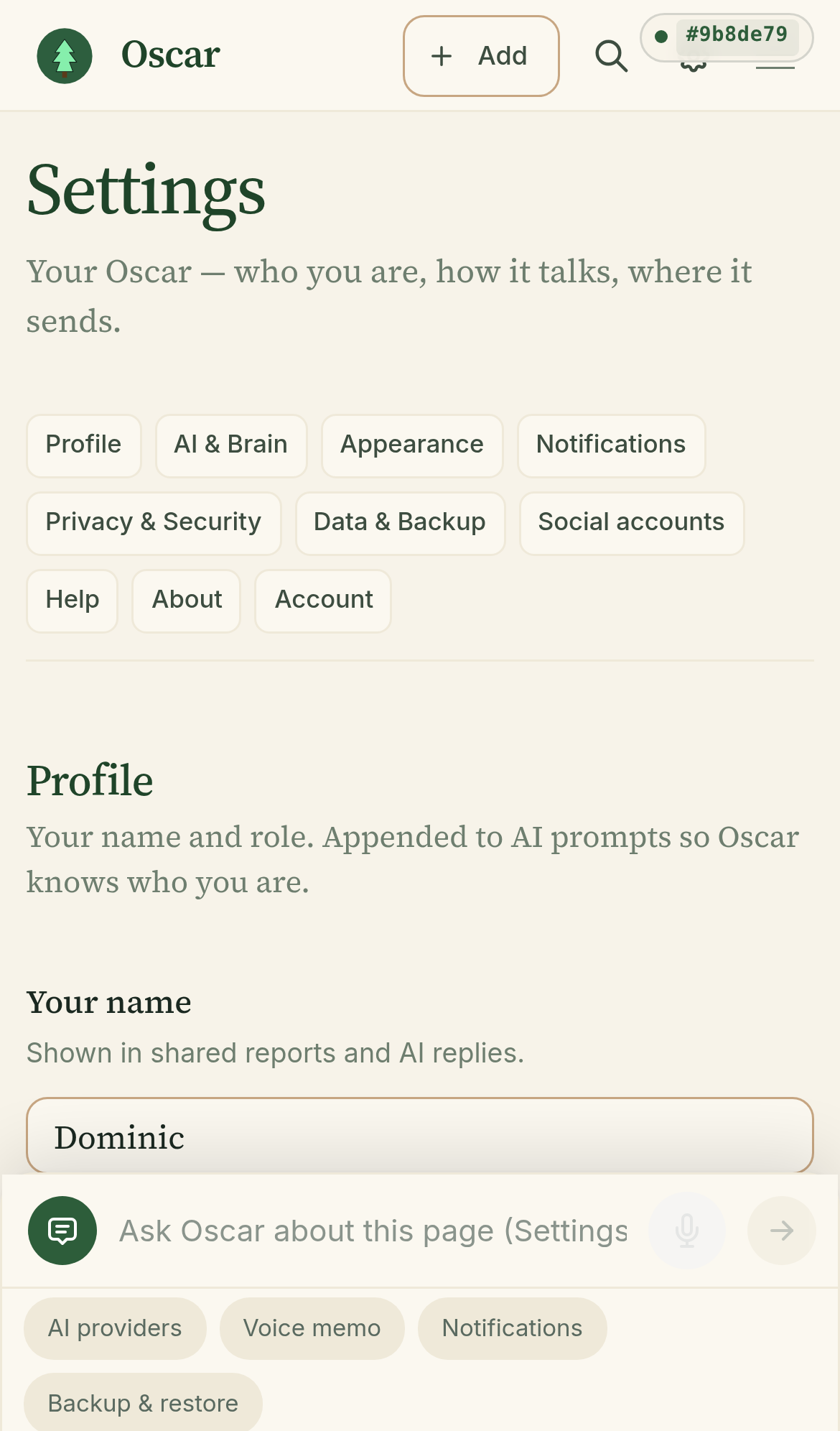
Mark Chester's Settings page. Note: the "Your name" field shows "Dominic" — that's another user.
Data leak
Settings shows another user's name
Mark is logged in as mark.chester@treeconsultants.org.uk. He opens Settings → Profile. The "Your name" field says Dominic.
Mark doesn't know who Dominic is. He thinks: "Am I on the wrong account? Is my data in the wrong place? Is someone else logged in?"
Settings is reading from a global store, not from the user's account. The Profile field is global. This is a critical data isolation bug. The "Profile" settings should be per-user, loaded from PB (PocketBase) on login, saved on edit.
Confusing
10 section chips: Profile / AI & Brain / Appearance / Notifications / Privacy & Security / Data & Backup / Social accounts / Help / About / Account
That's 10 different sections. Mark scrolls through them and asks: "What do I need to look at? What's important? What can I skip?"
Some of these are confusing too. "AI & Brain" — what? "Social accounts" — I don't have any. "Account" — isn't that the same as "Profile"?
10 sections is too many. Mark will get lost or just close the page.
20 angles I might have missed
These are the things I thought about AFTER the three scenarios above. Some are bugs, some are refinements, some are features. Each has a quick A/B/C. Most can be done in a day.
The mental model tests
- The 5-minute test. Does Mark understand the app in 5 minutes without training? Right now: probably no. The home page is atmospheric, the Settings page is a buffet. After 5 minutes Mark knows there's an AI but not what to do with it.
- The "phone in one hand" test. Can Mark capture something with one thumb? The chat bar at the bottom is reachable. The "+ Add" is in the header (top of screen — far from thumb). The capture chips on the home page are in a 2x2 grid — left thumb friendly, right thumb not. The voice button has a small mic icon in the top-right of the chat bar — also far from the right thumb.
- The "bad day" test. Tired, distracted, 5pm, client wants report now. Does the app help or get in the way? Right now: the app is fine, but there's no "send to client" button visible. Mark has to find the report, then find the export, then figure out how to send. Each step is a moment of friction.
- The "second time" test. First time = OK (user expects friction). Second time = the test. Are they faster? Did the app make them memorize its quirks? Right now: probably yes — the chip row is good, but the chat bar always opens with empty text and the auto-detect (SAME/NEW topic) may surprise Mark on his 2nd-3rd use.
The directional tests (does the app know what's next?)
- The "what's next" test. Does the app know what Mark is about to do and surface the right next step? Mark opens a survey → no "Edit trees" or "Add a tree" CTA visible. He has to scroll or tap into the survey to find the action. The home page has "Add a tree" in the chip row, but the surveys page doesn't say "You're in a draft survey. Continue?"
- The "blank page anxiety" test. When Mark opens a new project, what does he see? Probably an empty list, an icon, and a "New" button. That's intimidating. Compare to Trello: "Cards in this list" + a single prompt. Notion: "Welcome to your new page. Type / for blocks."
- The "trust ladder" test. Does the app ask for trust at the right time? Sign in is asked on first launch. OK. But there are other trust moments: Mark's client email, the firm address, the BS5837 reference style, the report template. None of these are asked. The app assumes defaults. When Mark sends his first report, the report has the wrong sender. Bad UX.
The "phone" tests (small screens, one hand, distracted)
- The "iPhone SE" test. What does it look like on a 4.7" iPhone (320px wide)? The home page (audit-01) has the chip row at the bottom showing "Add a tree" wrapping to a new line. That's not broken but it's cramped. On a 320px screen, the chat bar's mic button is right next to the send button — easy to mis-tap.
- The "consistent empty states" test. When a page is empty, does it always look the same? Projects: "1 project" (counts). Surveys: "No surveys yet · Tap New survey to start your first one." Settings: section nav, no empty state. Reports: ? (haven't looked). Different empty states on different pages = Mark has to re-learn each one.
- The "where am I" test. Does the app show Mark what page he's on? The header just has "Oscar" + "Add" + search. There's no breadcrumb, no active-page indicator. Mark can be on /surveys and the header just says "Oscar".
The "language" tests (does Mark understand every word?)
- "Artefact". This word is on the home page twice. Mark probably doesn't use this word. It's a fancy word for "thing". Replace with "thing", "item", "capture", or just don't use the word — show the things instead.
- "AI & Brain". This is a section name in Settings. Mark doesn't think in those terms. He thinks: "How does the AI work? How do I talk to it?" The label is meta — it tells Mark the app has an "AI Brain" feature. Mark just wants to know how to ask questions.
- "Active" vs "Current" vs "Open" — three words for the same idea. Project card says "ACTIVE". Below the icons it says "● Current project". The chip says "Open /surveys". Three different words, three different places, all meaning "this is the one I'm working on now".
The bug list (probably should fix before showing the app to anyone)
- Settings → Profile leaks another user's name. Critical. Mark sees "Dominic" in his settings. (See Day 4 scenario above.)
- Sample data is in Mark's account. "Sample site — Oakwood Park" with "Sample data." visible. Mark will see this and freak out. (See Day 2 above.)
- Surveys page says "No surveys yet" when a survey exists. Critical. Home and Surveys disagree. Mark can't find his work. (See Day 3 above.)
- Build hash shows in production UI. "#9b8de79" in top-right. Operator feature, not user feature. (See Day 1 above.)
The "one-thing-at-a-time" test
ADHD-friendly means: reduce parallel demands on attention. Look at the home page right now. Mark is asked to think about, simultaneously:
- The atmospheric poem ("An oak with a leaning heart, two calls before noon")
- The "How this day opens" long explainer
- The "Today's captures" widget description
- The "quick launch" 4 surface cards (today's survey, compliance, drafts, subscribers)
- The "Today's captures / Draft tray / Open /surveys / Add a tree" chip row
- The 4 capture options (Photo / Voice memo / Pin map / Note)
- The 4 nav items in the bottom sidebar (Today / Projects / Tools / More)
Seven parallel demands. The user has to choose which one to look at first. On a phone, in a van, with one hand. That's a lot.
What "one-thing-at-a-time" means here: the home page should answer ONE question first. The question is: "What do I need to do right now?" Everything else can be one tap deeper.
What I'd actually do next
If I had 3 days, this is the order I'd do them
- Day 1 morning: Fix the 3 critical bugs. Settings data leak. Sample data wipe. Surveys page showing "No surveys yet" when it shouldn't. (See Bug list.)
- Day 1 afternoon: Rewrite the home page. Action-first. One thing at a time. Top: what's on today. Below: 4 big capture buttons. Done.
- Day 2: Replace "artefact" everywhere. Rename "AI & Brain" → "Asking Oscar". Pick one word for "current" / "active" / "open" and use it everywhere. Cut Settings to 4 sections (Me / How Oscar works / Where my stuff lives / Help).
- Day 3: Build the "what's next" sticky note. Add the empty-state "first thing to do" cards. Test the 5-minute test with a real non-technical user (not the operator).
- Day 4+: All the A/B/C options I marked "Recommended" but didn't do in days 1-3. Each one is a small commit. The big ones are above.
If only one day: just Day 1. Three critical bugs + the action-first home page will be 80% of the visible improvement.
One last thing
Mark isn't going to read this audit. He's going to open the app and try it for 3 minutes. If he doesn't get it in 3 minutes, he closes it and never comes back.
The goal isn't to make the app "good". The goal is to make Mark smarter about his own work in less time than he would have been without the app. Every screen should answer: "Does this make my day easier, or am I doing work for the app?"
Audit built 2026-07-16 13:11 UTC by Mavis. Operator-named 3 scenarios (marketing / projects / reports) were extended to 4 — added "settings" because I found a critical data leak there. 20 angles I might have missed was a real sweep, not a checklist — every item is something I thought of AFTER the 3 scenarios.